In the ever-evolving world of web design, staying ahead of the curve is crucial to creating a website that attracts visitors and keeps them engaged. As we move into 2024, a thrilling wave of web design trends is poised to reshape the digital landscape. These trends push the boundaries of creativity while delivering optimal user experiences. The good news? WordPress, with its versatility and ever-growing collection of themes and plugins, provides the perfect foundation for translating these trends into stunning, functional websites.
This article will unpack the most exciting web design trends of 2024 and demonstrate how WordPress empowers you to bring them to life. Get ready to discover how bold typography, playful maximalism, AI integration, and a focus on inclusivity will transform the way we design and interact with websites. Whether you’re a seasoned WordPress veteran or just starting out, this guide will equip you to build a website that’s both visually stunning and exceptionally user-friendly.

Trend 1: Bold Typography and Kinetic Motion
Forget subtle, understated fonts – the world of web design in 2024 is all about letting your typography speak volumes. Oversized, eye-catching headlines and statements create instant impact, drawing visitors into your content. But this trend isn’t just about size – kinetic typography adds another dimension. Subtle animations and carefully choreographed text movement further enhance the visual appeal and emphasize key messages.
Bringing the Trend to WordPress
Here’s how to harness bold typography and kinetic motion within your WordPress website:
- Font Selection: Ditch generic fonts in favor of bolder options. Explore resources like Google Fonts for a vast range of free, visually impactful typefaces. Consider contrasting serif and sans-serif fonts for added hierarchy and intrigue.
- Customizing Font Sizes: Experiment with significantly increasing font sizes, especially for headlines and section titles. WordPress’s visual editor allows for easy text size adjustments.
- Kinetic Typography Plugins: Enhance the effect with dedicated plugins. Options like “Kinetic Typography Engine” or “Text Animation” provide customizable text animations without requiring extensive coding knowledge.
- Strategic Application: Use this trend in moderation. Apply it to headings, calls to action, or short, impactful phrases to guide the user’s eye and highlight important information.
Important Note: Ensure that animations are subtle and tasteful. Prioritize smooth motion that does not impede readability or distract from your website’s core content.
Tips for Maintaining Readability
- Contrast is Key: Choose background colors that sharply contrast with your text. Good contrast ensures that even large or animated text remains easily legible.
- Negative Space: Give your typography ample breathing room. Avoid overcrowded layouts, and strategically use negative space (i.e., empty space) to guide the user’s eye and emphasize key elements.
- Limit Animation Duration: Keep text animations short and snappy. Overly long or elaborate animations become distracting and can significantly increase page load times.
- Utilize Hierarchy: Create a clear visual hierarchy with varying font sizes and weights. Bold typography and animations should be reserved for the most important headlines and calls to action.
- User Testing: Get feedback from real users. Do animations cause distractions, or do they help draw attention to critical content? User testing can reveal crucial insights.
WordPress Plugin Examples
- Animate It!: A simple and user-friendly plugin offering a variety of text animation effects (fading, bouncing, flipping, etc.).
- WP Typography: While not focused solely on animation, this plugin empowers you to fine-tune fonts, sizes, line spacing, and more, giving you granular control over readability.
Remember: the goal is to enhance readability, not hinder it. When implementing these trends, err on the side of subtlety and always keep the user experience in mind.
Trend 2: Maximalist Design
Prepare to ditch minimalism in 2024! Maximalism is a bold design rebellion defined by vibrant color palettes, playful patterns, layered textures, and an unabashed “more is more” attitude. This trend invites experimentation and encourages websites to express their unique identity in a loud and visually captivating way.
Maximalism Meets WordPress
WordPress offers the flexibility and tools to fearlessly embrace this trend:
- Themes as a Base: Explore WordPress themes designed with maximalism in mind. Look for themes featuring bold colors, eye-catching graphics, and playful layouts. These themes provide a solid foundation for building your maximalist masterpiece.
- Bold Color Palettes: The WordPress block editor makes it easy to implement a vibrant color scheme. Select from your theme’s pre-defined palette or use hex codes for specific shades.
- Pattern Overlays and Backgrounds: Add pops of visual interest with repeating patterns or textured backgrounds. WordPress comes with a built-in library of options, or you can easily upload your own.
- Image Collages and Galleries: Create dynamic visual displays by layering images with varying sizes and shapes. WordPress gallery blocks come with customization options, or you can explore more advanced image collage plugins.
- Creative Font Pairings: Don’t be afraid to experiment with contrasting font styles to add a maximalist vibe. Combine a bold display font with a quirky handwriting font for added personality.
A Word of Caution
Executed skillfully, maximalism can be incredibly effective. However, unmanaged maximalism risks creating a cluttered, overwhelming user experience. Keep these guidelines in mind:
- Strategic Curation: Don’t just throw everything on the page. Carefully curate a selection of colors, patterns, and fonts to maintain a sense of cohesion.
- Focal Points: Create clear visual “anchors” amid the busyness. Well-structured headings and negative space help avoid sensory overload.
- Accessibility Considerations: Even within maximalism, accessibility is crucial. Ensure good color contrast and font legibility for users with disabilities.
Here are a few WordPress theme examples embracing the maximalist aesthetic. It’s worth noting that many themes can be styled with a maximalist mindset, even if they’re not labeled as such:
- Phlox Pro https://www.phlox.pro/go/ An extremely popular and flexible multipurpose theme. Its wide range of demos includes several leaning towards maximalism with rich colors, overlapping elements, and a sense of organized abundance.
- Kalium https://kaliumtheme.com/ Features bold graphics, striking layouts, and vibrant color schemes. Perfect when you want your website to have a loud and distinct personality.
- Divi: Since we love Divi and provide it free on our WordPress and Business Hosting plans, we better mention it here are well. While known for its clean, streamlined options, Divi’s powerful builder grants full control over colors, layering, typography, and offers modules perfect for crafting those playful collages and visually complex layouts.
Important Note: Maximalist designs can be demanding on resources. Check reviews and consider theme demos’ loading speed to ensure your website won’t be sluggish.

Trend 3: Embracing Asymmetry and Organic Shapes
In 2024, it’s time to break free from rigid grid-based layouts! Asymmetry and organic shapes offer a sense of natural fluidity and visual interest. Curving lines, unexpected shapes, and playful placement of elements create websites that feel fresh and dynamic, while still adhering to underlying design principles.
Implementing the Trend with WordPress
Here’s how WordPress helps you incorporate this trend:
- Layout Builders: Advanced page builders like Elementor, Divi, or Visual Composer provide increased flexibility when building layouts. They allow you to position elements with more freedom, escaping traditional grid structures.
- Shapes and Blobs: Many WordPress themes come with built-in shape elements or options to use “blob-like” designs. Look for these in backgrounds, section dividers, or as decorative elements.
- Image Editing Tools: Use a basic image editor (even one free and online) to crop images into organic shapes, giving your content a unique flow. WordPress seamlessly handles these customized images.
- Asymmetrical Overlays: Break up content sections with diagonal patterns, angled backgrounds, or offset image overlays to introduce more dynamism.
- Negative Space: Used strategically, negative space highlights asymmetrical elements and allows them to pop, preventing overload.
Balancing Beauty and Usability
While asymmetry offers exciting possibilities, ensure that navigation and readability remain intuitive.
- Visual Hierarchy: Maintain a clear hierarchy with careful font choice and strategic use of space, guiding users through content despite unexpected layouts.
- Focal Points: Clear ‘islands’ within the asymmetry act as anchors, providing rest for the eyes and focusing attention on essential content or calls to action.
- Subtlety Is Powerful: Remember, you don’t need to be wildly asymmetrical on every page. Smaller touches go a long way!

Trend 4: The Rise of AI in Web Design
Artificial Intelligence (AI) is rapidly transforming the web design landscape. While the full potential of AI-powered design tools is still emerging, it’s clear that in 2024, AI will enhance creativity, streamline processes, and open up new ways to personalize user experiences.
How AI Can Fuel Your WordPress Website
Here’s where AI intersects with WordPress for exciting possibilities:
- AI Image Generators: Tools like DALL-E 2 or Midjourney can generate images from text descriptions. Use them to source unique graphics, custom backgrounds, or even concept art for your website.
- AI-Powered Design Suggestions: Explore themes or plugins that analyze your content and suggest layouts, color schemes, or optimize existing elements, especially helpful for design novices.
- Content Optimization: AI tools can help rewrite product descriptions, craft impactful headlines, and analyze text readability. WordPress-specific plugins offer these capabilities.
- Conversational AI Chatbots: Enhance customer service with smart chatbots that use Natural Language Processing (NLP) to hold dynamic conversations, answer common questions, and reduce manual support tasks. Several chatbot plugins integrate readily with WordPress.
- Personalization: Some AI tools analyze user behavior to tailor webpage layouts, offers, or content according to individual preferences. Look for personalization-focused plugins for WordPress.
Important Considerations
- AI as a Tool: AI assists rather than replaces web designers. Its output needs refining and should be aligned with your overall brand and style guide.
- Ethical Use: Consider ethical implications, especially with text generation. Avoid plagiarism and ensure generated content is factually accurate.
- Evolving Landscape: Explore emerging AI platforms and WordPress plugins designed to harness AI’s power as their availability increases.
Here’s a selection of AI-powered tools and plugins to keep an eye on. Remember, AI in web design is a rapidly developing field, so new tools are always emerging:
AI Image Generators
- DALL-E 2 (https://openai.com/dall-e-2/): A leader in the field, generating incredibly realistic and nuanced images from your text descriptions. (Currently has a waitlist).
- Midjourney (https://midjourney.com/): Create artistic and stylized images through its Discord-based interface.
WordPress Plugins (with an AI Focus)
- Copy.ai or Writesonic: Offers AI-powered content rephrasing, headline generation, and short-form copy for landing pages or product descriptions.
- WordLift: Analyzes your content, automates structured data markup, and suggests related content with the goal of making your website more SEO-friendly.
- Chatbot Plugins (many exist): Explore options like Collect.chat, IBM Watson Assistant, or LivePerson based on your desired complexity and level of integration with your existing site data.

Trend 5: Data Visualization and Storytelling
The rise of data-driven industries makes visually compelling data presentations more vital than ever. In 2024, it’s not just about displaying information; it’s about turning data into narratives that users can easily grasp and that generate actionable insights. Web design plays a crucial role in effectively marrying design with data in informative and aesthetically engaging ways.
Implementing the Trend with WordPress
WordPress provides tools to achieve impactful data visualization:
- Dedicated Chart and Graph Plugins: Plugins like Visualizer, wpDataTables, and Data Tables Generator are designed to transform data into beautiful, interactive charts, graphs, and tables. They usually include templates and extensive customization options for styling.
- Infographics: Use free or premium infographic templates for visualizing data points, timelines, or statistical summaries. Explore dedicated infographic blocks offered by page builders.
- Data-Driven Animations: Subtle animations can help bring statistics and graphs to life. Some chart plugins support small animations on load, while tools like LottieFiles integrate into WordPress for custom animated elements.
- Micro-interactions: Interactive filtering, clickable maps, or charts that provide more details on hover enhance engagement with your data presentation.
Key Considerations for Success
- Clarity over Complexity: Select the right type of chart or graph to represent your data accurately. Don’t sacrifice clarity for overly elaborate styles.
- The Power of Narrative: Provide context alongside your visualizations. Write short explanatory summaries or guide users through data trends with headings and clear annotations.
- Accessibility: Use alternative text (alt text) to describe visualizations for users with visual impairments. Many charts plugins include an option to implement alt text for screen readers.
Don’t hesitate to get creative with styling! Data visualizations should fit seamlessly with your website’s overall design and color scheme.
Let’s look at a couple of different examples showcasing excellent data visualization:
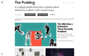
The Pudding (https://pudding.cool/): Renowned for creative visual essays, The Pudding pushes the boundaries of data visualization in web design. Their projects flawlessly merge infographics, stunning graphics, and interactive elements to tell unique stories with data.
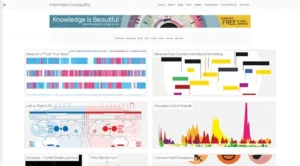
Information is Beautiful (https://informationisbeautiful.net): This site serves as a vast inspiration gallery for data visualizations. You’ll find examples ranging from intricate infographics to minimalist timelines, showcasing the sheer breadth of possibilities for presenting complex information in engaging ways.
Key Points to Learn From These Examples:
- Interactivity: Explore how user interaction can reveal different layers of data, whether through filtering, hovering, or zooming into detailed graphics.
- Variety: Observe the array of charts and graphic styles employed. Notice how visuals are selected to suit the underlying data.
- Story-Focused: Pay attention to how visualizations are interwoven with a compelling narrative—it’s rarely just raw data and charts dumped on a page.
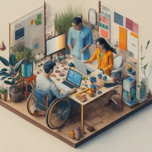
Trend 6: Inclusive Design with Accessibility Focus
Inclusive design goes beyond a trend in 2024; it’s an ethical responsibility and a key indicator of successful web design. Creating with accessibility in mind ensures that everyone, regardless of ability, can easily navigate, interact with, and understand your website’s content. This not only benefits users with disabilities but also improves the overall experience for everyone.
WordPress and Accessibility
WordPress has a strong dedication to accessibility and actively works to promote the creation of inclusive websites. Here’s how WordPress facilitates this:
- Accessibility-Ready Themes: The WordPress theme directory offers a dedicated “Accessibility Ready” tag. These themes have been reviewed for basic accessibility standards.
- Built-in Features: WordPress includes core features that contribute to accessibility, such as:
- Alt-text for images
- Heading structure tools
- Keyboard navigation
- Accessibility Plugins: An array of plugins exist to further enhance accessibility:
- One Click Accessibility: Offers quick fixes and an accessibility widget.
- WP Accessibility Helper: Allows color contrast adjustments, font resizing, etc.
- UserWay: A free widget with various accessibility tools and a customizable interface.
Implementing Inclusive Design Practices
- Follow WCAG: Familiarize yourself with the Web Content Accessibility Guidelines (WCAG), widely acknowledged accessibility standards.
- Color Contrast: Choose color combinations with a contrast ratio meeting WCAG requirements. Use free online contrast checkers for easy evaluation.
- Screen Readers: Test your website with a screen reader (NVDA, VoiceOver) to experience content from the perspective of a visually impaired user.
- User Testing: Invite individuals with various disabilities to test your website and provide feedback on navigation, content clarity, and any obstacles they encounter.
Important Note: Accessibility is an ongoing journey. Stay updated on best practices and utilize tools to assess and enhance your site regularly. Here are a few excellent resources to kickstart your website’s accessibility audit and learn more about inclusive design principles:
- Official WCAG Website: The source for the Web Content Accessibility Guidelines. Provides checklists, techniques, and explanations of each success criterion. (https://www.w3.org/WAI/standards-guidelines/wcag/)
- WebAIM: Web Accessibility in Mind offers practical articles, guides, and checklists geared towards designers and developers. (https://webaim.org/)
- SiteImprove Accessibility Checker: This freemium tool scans your website and provides a detailed report of accessibility issues, along with explanations and suggestions for improvement. (https://siteimprove.com/)
- Accessibility Developer Tools (Chrome): Google Chrome’s built-in developer tools include an accessibility audit with visual overlays and helpful reports.
Additional Tips
- Seek Community Resources: Accessibility-focused groups and forums often exist online and within the WordPress community. Utilize them for troubleshooting and tips.
- Plugins With Caution: Plugins claiming to “fix” accessibility rarely provide an all-in-one solution. While they can assist, understanding the fundamentals of inclusive design is essential.
Remember, creating an accessible website benefits everyone and makes you a more ethical and impactful web designer!
Conclusion
The web design landscape of 2024 promises to be vibrant, user-centric, and powered by exciting technological advancements. Embracing bold fonts, playful maximalism, the subtle dynamism of asymmetry, AI-powered creativity, data-driven storytelling, and an unwavering commitment to inclusive design empowers businesses and website owners to stand out.
WordPress stands as the ideal foundation for implementing these trends. Its flexibility, user-friendliness, and ever-expanding array of themes and plugins allow you to design a website that perfectly balances cutting-edge aesthetics with seamless functionality. Remember, true innovation in web design isn’t just about the looks—it’s about crafting unforgettable experiences that are welcoming and functional for everyone.

